


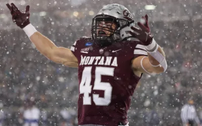
Vince Genatone Commits To Nebraska
After a pit stop at Montana, Vince Genatone is the latest in-state player to find a home at Nebraska. Genatone, a three-sport star at North Platte in the 2022 class, spent his first two seasons at Montana. He entered the transfer portal earlier this year after his...
Husker Quarterbacks Speak on Progress Early in Spring
No position in football garners the spotlight quite like quarterback, and after Thursday’s spring practice, all three scholarship signal-callers in Lincoln took turns in front of the cameras to speak with the media. Offensive coordinator Marcus Satterfield and...
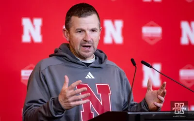
Nebraska Finds Its Quarterback With Dylan Raiola Commitment
Nebraska football and head coach Matt Rhule have found their quarterback for the future, as five-star Dylan Raiola officially flipped his commitment to the Huskers on Monday.
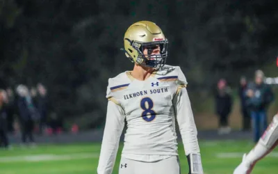
Huskers Add to 2024 Walk-On Class
Nebraska football’s 2024 walk-on class got another addition on Wednesday when Elkhorn South senior Ethan Duda announced his commitment.
Recapping Nebraska’s Loss vs Michigan State | The Run Live at Hurrdat Sports Bar & Grill
With your host Ana Bellinghausen, Johnny and Tommie are back together at the Hurrdat Sports Bar & Grill. They kick off the show with a recap of Nebraska's loss to Michigan State last Saturday, then give their predictions and keys to the game...
Nebraska Football Analysis w/ Mitch Sherman | Hurrdat Sports Radio
Mitch Sherman joins the show to discuss Elliott Brown’s influential role in Nebraska football, strategies for the upcoming Maryland game, and Heinrich Haarberg’s pressure play. Follow Hurrdat Sports on social: Twitter:...

Game Day Punishments and Predictions w/ Michael Bruntz | Hurrdat Sports Radio
Ravi Lulla and Andrew Rogers are joined by Michael Bruntz to discuss Nebraska's football strategies and upcoming games, plus a tribute to retiring coach Fred Petito. Follow Hurrdat Sports on social: Twitter: http://twitter.com/hurrdatsports ...
Will the Huskers Bounce Back vs Maryland? | Nebraska Football Preview
Avarie Howard and Ravi Lulla are back to break down the pivotal matchup between Nebraska and Maryland at Memorial Stadium. As both teams aim to secure a bowl game spot, we dissect the X-factors, coaching strategies, and the impact of home-field...
How Huskers Can Learn from Losses | Hurrdat Sports Radio
Ravi Lulla and Andrew Rogers delve into how the Huskers learn and evolve from each game's challenges. Follow Hurrdat Sports on social: Twitter: http://twitter.com/hurrdatsports Instagram: http://instagram.com/hurrdatsports Tiktok:...
Subscribe To Our Newsletter
Get bi-weekly emails from Mike Babcock about Nebraska history and what’s top of mind for him in Husker athletics each week.